Python Github用户数据分析一 用matplotlib生成图表
如何分析用户的数据是一个有趣的问题,特别是当我们有大量的数据的时候。
除了matlab,我们还可以用numpy+matplotlib
python github用户数据分析
数据可以在这边寻找到
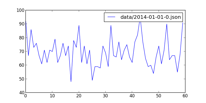
最后效果图
要解析的json文件位于data/2014-01-01-0.json,大小6.6M,显然我们可能需要用每次只读一行的策略,这足以解释为什么诸如sublime打开的时候很慢,而现在我们只需要里面的json数据中的创建时间。。
== 这个文件代表什么?
2014年1月1日零时到一时,用户在github上的操作,这里的用户指的是很多。。一共有4814条数据,从commit、create到issues都有。
python json文件解析
 import json
 for line in open(jsonfile):
      line = f.readline()
然后再解析json
import dateutil.parser
lin = json.loads(line)
date = dateutil.parser.parse(lin["created_at"])
dateutil,因为新鲜出炉的数据是string需要转换为dateutil,再到数据放到数组里头。最后有就有了parse_data
def parse_data(jsonfile): f = open(jsonfile, "r") dataarray = [] datacount = 0
for line in open(jsonfile):
    line = f.readline()
    lin = json.loads(line)
    date = dateutil.parser.parse(lin["created_at"])
    datacount += 1
    dataarray.append(date.minute)

minuteswithcount = [(x, dataarray.count(x)) for x in set(dataarray)]
f.close()
return minuteswithcount
下面这句代码就是将上面的解析为
minuteswithcount = [(x, dataarray.count(x)) for x in set(dataarray)]这样的数组以便于解析
[(0, 92), (1, 67), (2, 86), (3, 73), (4, 76), (5, 67), (6, 61), (7, 71), (8, 62), (9, 71), (10, 70), (11, 79), (12, 62), (13, 67), (14, 76), (15, 67), (16, 74), (17, 48), (18, 78), (19, 73), (20, 89), (21, 62), (22, 74), (23, 61), (24, 71), (25, 49), (26, 59), (27, 59), (28, 58), (29, 74), (30, 69), (31, 59), (32, 89), (33, 67), (34, 66), (35, 77), (36, 64), (37, 71), (38, 75), (39, 66), (40, 62), (41, 77), (42, 82), (43, 95), (44, 77), (45, 65), (46, 59), (47, 60), (48, 54), (49, 66), (50, 74), (51, 61), (52, 71), (53, 90), (54, 64), (55, 67), (56, 67), (57, 55), (58, 68), (59, 91)]matplotlib
开始之前需要安装``matplotlib
sudo pip install matplotlib然后引入这个库
import matplotlib.pyplot as plt如上面的那个结果,只需要
    plt.figure(figsize=(8,4))
    plt.plot(x, y,label = files)
    plt.legend()
    plt.show()
最后代码可见
#!/usr/bin/env python
# -*- coding: utf-8 -*-

import json
import dateutil.parser
import numpy as np
import matplotlib.mlab as mlab
import matplotlib.pyplot as plt


def parse_data(jsonfile):
    f = open(jsonfile, "r")
    dataarray = []
    datacount = 0

    for line in open(jsonfile):
        line = f.readline()
        lin = json.loads(line)
        date = dateutil.parser.parse(lin["created_at"])
        datacount += 1
        dataarray.append(date.minute)

    minuteswithcount = [(x, dataarray.count(x)) for x in set(dataarray)]
    f.close()
    return minuteswithcount


def draw_date(files):
    x = []
    y = []
    mwcs = parse_data(files)
    for mwc in mwcs:
        x.append(mwc[0])
        y.append(mwc[1])

    plt.figure(figsize=(8,4))
    plt.plot(x, y,label = files)
    plt.legend()
    plt.show()

draw_date("data/2014-01-01-0.json")
或许您还需要下面的文章:
围观我的Github Idea墙, 也许,你会遇到心仪的项目
comment
- 验证工程:从 Vibe 硬件编程 Loop 到自迭代验证
- 长程验证:AI Agent 长任务的收敛机制
- 从复杂编辑器到 Agent 工作台:Office 的 Cursor 时刻
- 注意力 Harness:多 Agent 时代如何守住人的注意力
- Agent 应该如何解决繁杂任务:从 /goal 到长时间运行
- 任务自适应 Harness:从 Trace 到多 Coding Agent 的协作记忆
- 从写清 Spec 到看懂功能:在 Session 历史中使用 Routa 重建需求全景
- Routa 桌面版发布:内建 Harness 工程的 AI Coding 研发协作工作台
- Harness Monitor:当多个 Agent 同时写代码时,如何看住质量
- Gate First:为你的 Agent Team 构建 Harness 防御体系
 Engineer, Consultant, Writer, Designer
ThoughtWorks 技术专家
工程师 / 咨询师 / 作家 / 设计学徒
开源深度爱好者
出版有《前端架构:从入门到微前端》、《自己动手设计物联网》、《全栈应用开发:精益实践》
联系我: h@phodal.com
微信公众号: 最新技术分享

- opensuse (10)
- django (41)
- arduino (10)
- thoughtworks (18)
- centos (9)
- nginx (18)
- java (10)
- SEO (9)
- iot (47)
- iot system (12)
- RESTful (23)
- refactor (17)
- python (47)
- mezzanine (15)
- test (11)
- design (16)
- linux (14)
- tdd (12)
- ruby (14)
- github (24)
- git (10)
- javascript (52)
- android (36)
- jquery (18)
- rework (13)
- markdown (10)
- nodejs (24)
- google (8)
- code (9)
- macos (9)
- node (11)
- think (8)
- beageek (8)
- underscore (14)
- ux (8)
- microservices (10)
- rethink (9)
- architecture (37)
- backbone (19)
- mustache (9)
- requirejs (11)
- CoAP (21)
- aws (10)
- dsl (9)
- ionic (25)
- Cordova (21)
- angular (16)
- react (14)
- ddd (9)
- summary (9)
- growth (10)
- frontend (14)
- react native (8)
- serverless (32)
- rust (9)
- llm (8)